A plumber in Logan rang us last month. He'd paid for a new website eight months earlier. Clean fonts, decent photography, a homepage video of him doing a hot water swap. He'd had three enquiries through it in eight months. Two were spam.
His old site, built by his wife's brother in 2017 on a basic monthly template, had averaged 8 to 12 enquiries a month. The new one looked twice as good and produced about 4% of the leads.
That's the gap. A site can look fine in a design review and still not generate a single enquiry. The same five faults keep showing up. This is what conversion focused web design actually means in practice: not awards, not aesthetics. It means the site does the job a small business needs it to do, turn a stranger into a booked enquiry.
Mistake 1: A page that takes four seconds to render
Largest Contentful Paint (LCP) is the time it takes for the biggest visible thing on your page, usually the hero image or headline block, to actually appear on screen. Google measures it because users measure it. If it's slow, they leave.
Google's Core Web Vitals guidance says LCP should be under 2.5 seconds. Most Australian small business sites we audit sit between 3.8 and 6.2 seconds on mobile. The plumber's site? 5.1 seconds. That homepage video he was proud of was a 14 MB autoplay file.
What you lose at that speed isn't subtle. At 5 seconds you're losing mobile visitors before they see anything, and if they came from a paid ad, you paid for a click that never saw your name.
Run your homepage through PageSpeed Insights. If LCP is red or amber, that's where your budget is leaking. Usual culprits: hero videos, uncompressed iPhone images, and bloated theme builders loading 40 scripts before anything renders.
Mistake 2: A buried phone number
This one costs trade businesses more leads than any other single fault.
The phone number should be in the header on every page, in your brand colour, and on mobile it should be a click-to-call link. That means tapping it dials your phone, no copy-paste, no "let me write it down."
What we find on real sites:
- Phone number only on the contact page
- Phone number in the footer as plain text (not clickable)
- Phone number hidden inside a hamburger menu on mobile
- "Request a call back" form instead of a number
Tradies and home service businesses lose callers when the phone number isn't immediately tappable. People with a burst pipe don't fill in forms. They ring the first plumber they can ring. Put your number in the header today.
Mistake 3: Copy that says nothing
Here's the kind of headline we see all the time: *"We're committed to delivering exceptional outcomes for every client through a dedicated approach to quality and service."*
That sentence could belong to a law firm, a panel beater, an embalmer, or a yoga studio. It rules out no competitors. It answers no question.
Compare it to two real headlines from LUNA Systems builds:
- *"We do labiaplasty in Sydney. Day surgery, 12-year track record, fixed-price quote within 24 hours."*
- *"We rewire houses in Logan and Ipswich. Licensed sparkies. Same-week bookings. No call-out fee under $300."*
Specificity sells. Suburb, service, proof, price posture. The test is simple: cover up the logo on your homepage. Could you swap it for a competitor's logo and the page would still make sense? If yes, your copy says nothing. Rewrite it until it could only possibly belong to your business.
Mistake 4: No proof a real person has used you
Stock photography is the first thing visitors clock as fake. The smiling woman with a headset, the team in matching white shirts in a glass-walled office, the handshake. Visitors have seen those exact images on dozens of other sites. They register as "this business has nothing real to show me."
Real proof looks like:
- Photos of your actual team (phone photos beat stock photos every time)
- Photos of actual work, the kitchen reno, the rewired switchboard, the finished hairstyle
- Named testimonials with first name, last initial, suburb ("Sarah M., Camp Hill")
- Google review screenshots or embeds with a working link out
- Case study numbers ("rewired a 1920s Queenslander in Paddington, three days, $11,400 final invoice")
The ACCC's guidance on online reviews is worth reading before you write a single testimonial. Fake reviews, edited reviews, suppressed negative reviews, and family-written reviews are all unlawful under Australian Consumer Law. HealthEngine copped a $2.9 million penalty for withholding negative reviews. The honest version is also the version that converts. Visitors believe specific. They don't believe smooth.
Mistake 5: A call-to-action that doesn't ask for anything specific
"Get in touch." "Schedule a consultation." "Learn more." "Contact us today."
These all sound like calls-to-action. None of them are. They're polite invitations that don't ask the visitor to commit to anything. The visitor reads "Get in touch" and thinks "yeah, I'll get in touch later." They don't.
A working CTA does one of two things:
- Books directly. Embed a calendar widget. The visitor picks a time, you both get a confirmation. This is exactly what online booking automation for service businesses is built to do. No back-and-forth. Service businesses should default to this.
- Asks a specific question that pre-qualifies the lead. Not "send us a message." Instead: "Tell us your suburb, what type of job, and your ideal start week." Three fields. The form asks for exactly the information you need to quote.
The reason vague CTAs fail is psychological. Visitors don't know what they're agreeing to. "Schedule a consultation" might mean a 20-minute Zoom or a three-hour sales pitch. So they close the tab. A booking widget removes the ambiguity. A three-field form removes the ambiguity.
The 10-minute diagnostic
Open your homepage on your phone, ideally on 4G with WiFi off. Then check:
- Does the main content appear in under 3 seconds? If you see a white screen or spinner past 3 seconds, your LCP is hurting.
- Is your phone number tappable in the header? Without scrolling, without opening a menu.
- Does your headline name your suburb and service? Or could it belong to any business in the country?
- Are there real photos of real people from your actual business? Or stock images and smiling models?
- Are there at least three named testimonials with suburbs? Or a wall of generic "Great service! ★★★★★, Jane"?
- Is there a booking widget or a specific multi-field form? Or just "Contact Us"?
- If a visitor wants to act right now, can they? Or do they have to email and wait?
If you scored less than 5/7, you've got the same problem the Logan plumber had. The site looks fine. It doesn't work.
What a fixed site looks like
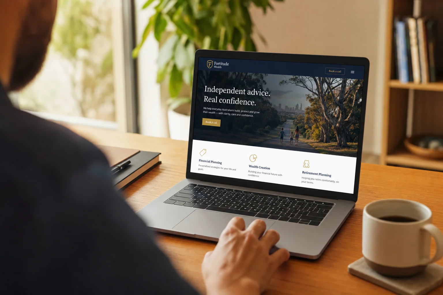
A site that works isn't more beautiful. It's blunter. The headline tells you what they do and where. The phone number is in the header in the brand colour. Photos are real. Testimonials have suburbs. The CTA is either a calendar or a three-field qualifier. The page loads in under 2.5 seconds because images are compressed and nothing autoplays. Not subtle, not awards-bait. It produces enquiries.
The Logan plumber rebuilt his site with us in March. Same domain, same Google ranking. Different structure. He's averaging 11 enquiries a month now, three months in. Same traffic, different conversion rate. That's the whole game.
FAQ
My site looks great. Why isn't it converting? "Looks great" and "works" are different jobs. Conversion focused web design optimises for enquiries, not aesthetics. The faults usually aren't visual.
Do I need to rebuild from scratch? Usually no. We rebuild about one in three. The other two-thirds need targeted fixes, phone number in the header, image compression, copy rewrite, a real booking widget. That's a scoped fix, not a full rebuild, and we quote it per project after a discovery call.
Is a slow site really that big a deal in 2026? Yes. The Australian Communications and Media Authority reported that 97% of Australian adults accessed the internet through a mobile phone in 2025, so expect a large share of your visitors to be on mobile, and check your own analytics for the split. A 5-second LCP on mobile means many of them leave before they see anything. No design choice on the rest of the page compensates for that.
Can I use stock photos at all? For backgrounds and abstract textures, fine. For anything claiming to represent your team, customers, work, or premises, no. Real phone photos taken on-site beat stock library shots every time.
What about testimonials from a long time ago? Use them, but date them honestly. "John K., Toowong, 2023" is fine. Undated testimonials read as ancient or fabricated. The ACCC's rules are clear: don't suppress, don't fabricate, don't pay for.
How do I know if my CTA is working? Look at analytics. If less than 1% of homepage visitors take the primary action, the CTA is broken. Average for a well-built service business site is 3 to 7%.
The honest version
Most small business websites in Australia were sold the wrong product. The agency invoiced for design. The owner needed a conversion machine. They got a brochure with nicer typography.
If your site has any of the five faults above, it's worth fixing before you spend another dollar on Google Ads or SEO. Pushing traffic to a broken funnel is just expensive disappointment.
We run free 20-minute audits where we screen-share your site, walk through the diagnostic, and tell you whether you need a rebuild or a fix list. No pitch deck. Book one through our contact page, or read more on our website design service page.
Related reading:
- Website Design for Lead Generation: A Practical Guide for Australian Service Businesses
- DIY website builder vs developer in Australia: real costs in 2026
- Business automation cost in Australia: what you'll actually pay in 2026
- Is AI worth it for small business in Australia?
If you want the full picture of what LUNA Systems builds for Australian small businesses, sites, SEO, automations, the CRM that sits underneath it all, start at our services overview or get a custom quote.

Founder, LUNA Systems · Registered Nurse (AHPRA: NMW0002113429)
Former nurse and beauty therapist turned automation consultant. Justine builds custom AI systems for Australian service businesses, so they can stop chasing leads and start growing.
Want automation tips in your inbox?
Get weekly insights on business automation. No spam, unsubscribe anytime.